Wednesday, December 14, 2011

Annotating is disabled for sample content

You fail me again, Amazon.com.  You fail me again.  Here I am, trying to be good.  Sampling a real book.  Thinking about buying.  Reading the first chapter.  Enjoying it.  Then I want to highlight a good passage.  There's a good chance I'll buy this book.  I'm a potential customer.  What am I greeted with:

Annotating is disabled for sample content

This is not the way to treat people.  I could spread awareness about the book by tweeting out a quote.  I could be well served as a customer by being able to annotate the first chapter and then transfer my annotations to a paid version of the book.  Why?  Why, Amazon.com, must you allow the foolish publishers to block access to the very tools that make e-reading the future?  Why must you allow them to stand in the way?  Why treat your users like this?  There is no DRM on pirated content.  Why must you continue to make paid content inferior?

Tuesday, October 18, 2011

Best use for a Kindle: Reading Big Books, Series Books and Free Classics

I really like to read big books like Infinite Jest or Moby Dick on the Kindle.  This way I have no idea how much the book actually weighs when I carry it around.  Sure I have to read it for what seems like forever (which is counterintuitive, because the kindle is so thin), although when I finish I don't have a trophy to put on my shelf, all I have to do is return to the menu to pick out another book and keep the reading going.  (it's also great for series books.  Finishing Book 6 of Dune and instantly starting Book 7 was quite a cool way to go.  Also a big fan of the free classics.)

The Kindle should display the cover of the last read book instead of Jane Austen's dour face

Image from a google search for Jane Austin Kindle
Okay.  Sponsored Kindle is a big hit.  I don't like ads, but other people don't care and love cheap things, so Sponsored Kindle is the hottest thing around.  I was wrong on that one, but it still doesn't mean that Amazon couldn't update the original paid Kindle to display the cover the book you've been reading so that the device more resembles a normal book.  I think it would really help me restart my reading more than seeing Jane Austen's dour face.  (or a way to choose certain authors, choose different screen savers, etcera, etecera)  Capturing an image on screen is a really neat feature of e-ink and I don't think Amazon has done near enough to exploit this technology for it's non-advertising based users.

It could also display recent things you've highlighted, a list of recent books you've read, quotes from your friends, their reading progress, your reading progress, general reading based stats.  In general I'd say the thing doesn't give me nearly enough stats or coach my reading, but I guess that's a topic for another day.   For now I'll just wish again, for the thing to display a proper book cover instead of Jane Austen's dour face.

Wednesday, June 29, 2011

Amazon Cloud Player - Add to playlist with just 5 clicks! - Set phasers on annoying


This the worst kind of dialogue box.  Every attempt to use it involves a wasted click.  Let's say I just want to add it to my "_Tops" playlist, that I'm using as a pathetic kludge until they add a star button.  If it showed the first playlist in the selector, I could just click Save and be done with this.  Instead, I have to click, select the playlist, and then click save. Everytime. Waste of clicks.  Waste of time.  Annoying.


Amazon Cloud Player
Number of Clicks to Add to Playlist5


1. Click Song
2. Click Add to Playlist
3. Click select playlist
4. Click playlist name
5. Click Save


Google Music Beta
Number of Clicks to Add to Playlist2

1. Click Select Song
- Drop down menus to playlist
2. Click playlist name


iTunes
Number of Clicks to Add to Playlist2

1. Select Song
2. Drag and drop to playlist


Disclaimer: Okay.  I see it now.  They have another add playlist button along the top of the song list that uses drop downs.  But when you click on the song, that one doesn't have the drop downs. Google seems simpler, but that's only because they're only working through song at at time, not having reached the multiple select stage of complexity.


Amazon Cloud Player - Quick Hits

1. Unhide the volume controls!

2. Make the Controls/song information it's own frame so I can control my music all the time.

3. Need Star button to like songs, rate songs, etc.  I'm sure you know all that, but it still seems really odd that you're ahead of google, but you don't even have a simple star, so I can add a good song to a starred list.

4. I like the Latest Purchases button, but maybe it should be a "+ menu" that shows me the recent albums so I can quickly select the album I bought and listen only to that with a few clicks.

5. Skips - if I skip a song it should be depreciated.  Also without a play count column it's a bit tough to figure out where I was in an album if I accidentally close the browser tab (which seems to be the biggest problem so far.  Accidental Tab Closure = Music Stoppage and Total Place Loss.  This is the one that needs to be fixed in this cloud player thing is going to take off.)

6. Columns don't sort, no track numbers.  Basically it's just confusing to drill down to an album to avoid random shuffling.  It has a very mp3.com circa 2000 feel.  Yawnsville.

Sunday, June 5, 2011

Kindle Screensaver - It needs to display the book cover

I really don't understand why, when I turn the Kindle off, it doesn't display the cover of the book I'm currently reading.  It would help it seem more like a real book (whenever you looked at it, you'd say, wow I can't wait to start reading "Book Title" again...), instead of a strange screensaver, that sometimes I like (showing pictures of authors I read who are smiling) and sometimes I don't like (creepy pictures of Emily Dickinson, Virginia Woolf and other authors who have committed suicide).  What's the deal Amazon?  This is Kindle3 and it still doesn't display the book cover?  Just seems silly.

Tuesday, May 17, 2011

Kindle Leather Lighted Cover

I bought the Kindle Leather Lighted Cover at the same time as the kindle and most of the time I find myself removing the Kindle from the cover and setting the cover aside to make the Kindle lighter and I have rarely had reason to use the light.  It seems like a nice protector when I slide the kindle + cover into my laptop bag for travel, but it doesn't seem like I'm really using it to it's full potential.  Maybe something like a sleeve would be more appropriate for my needs.  I'd sure like to try one.

Thursday, April 14, 2011

Kindle for Mac: Feedback Screen discourages feedback


Message boxes like this make me never want to leave feedback.  You care enough for me to do free tech support for you, but you're not going to give me credit for any of my ideas or be able to ask me clarifying questions about my complaints?  Really seems like a black hole that I don't know why anyone would want to contribute feedback to.  Just like the classic SNL Sketch:  "We're the Phone Company.  We don't care.  We don't have to."

Lilly Tomlin in the Classic SNL Phone Company Sketch


Kindle for Mac: Mousewheel page scrolling really unnecessary

I keep scrolling by my Kindle window, causing the pages to flip uncontrollably and me to curse, trying to get back to the page I was on, while not spoiling the material now flying past my eyes.  Why is mousewheel scrolling necessary on Kindle for Mac?  People are reading your books for fun, yes?  Who's trying to scroll faster through their endlessly descriptive seemingly never-ending heavily footnoted tome?  Scrolling is for webpages with gobs of useless information that you're really only searching through to find the section you want to read.  Reading books is different.  Under no circumstances do I want the pages flying by at a rate so fast I can't read them.  You're not planning on adding a scrollwheel to the next version of the Kindle are you?  Then why'd you put one in your Kindle for Mac software?  Does anybody at Amazon test this software?  Anybody who reads (at the whole company, not just the testing department)?  Cause I don't see reading and scrolling to be the same thing.

Ah well.  More endless hot air as I complain to no one.  Back to my book.

Wednesday, April 13, 2011

Kindle for Mac: Dictionary Box doesn't disappeer

If the Dictionary Box fails to define the word, it should disappear.  Even if it finds the word, it should disappear after a few seconds.  Remove the close button.  Make the box disappear automatically:

No definition found.  Just an annoying box.

Down with close buttons!  Down with unnecessary clicks!

Tuesday, April 12, 2011

Kindle for Mac: Multipage Highlighting still impossible, Too many page advance buttons and bookmark button still ridiculous

As I complained on December 12, 2010, it's impossible to do a multipage highlight on the mac and I had to yet again resort to creating two separate highlights that straddle the page.

It's also annoying the way clicking on the page advances the page.  I think we've already got enough ways to advance the page, and could do with a few less.  When I click on the page I'm trying to get the cursor to go away so I can get back to reading.  This does not need to advance the page.  Also the mouse wheel does not need to advance the page.  I really can't read that fast.  Advance the page if the user clicks in the gutter next to the page, not the page.  Advance the page on space bar, right arrow and that's more than enough ways to advance the page.

Also, clicking "+" to add a new bookmark instead of pushing the bookmark button is still ridiculous.

Kindle Quick Hits


Kindle for Mac - New Features:  I like the highlight a word auto look up in the dictionary and even better than that I love the Google and Wikipedia buttons that I use after the word doesn't exist in your pitiful dictionary.  Good job thinking about what happens when the word's not there and the user still wants to look it up.  Way to use the fact that I'm already on the computer to lead me to more information.  Still needs FB/Twitter integration so I can quote from it the same way I can quote from my kindle.  (Of course I can't quote from my kindle ever since Infinite Jest went over the clipping limit and became an old fashioned book that you have to retype quotes from, but that's a different story altogether).


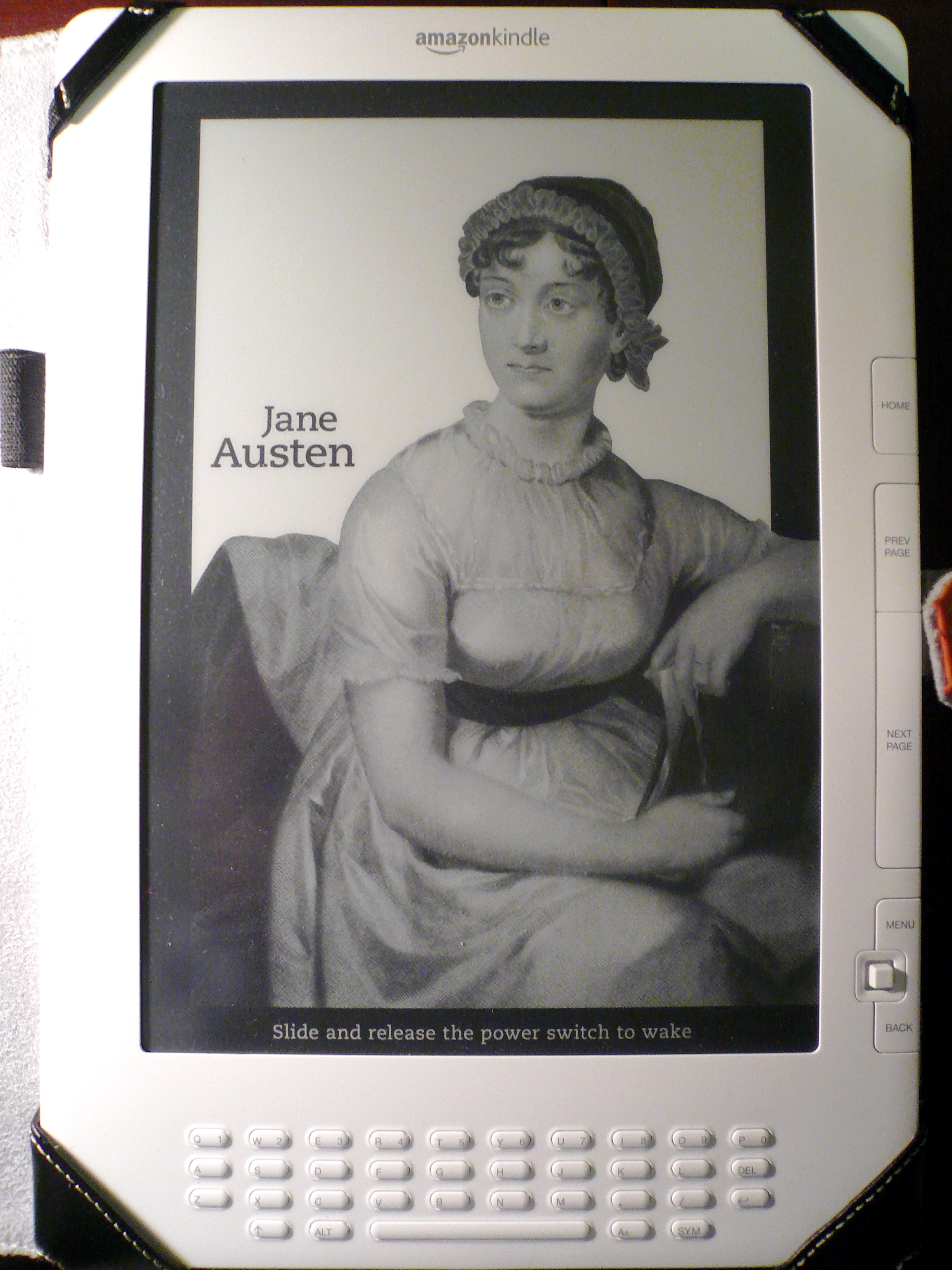
Kindle Device Update: Did the software update this morning, but was still a little terrified during the reboot process.  What if it doesn't come back on?  But it did and all seemed fine.  Location numbers were gone, but there were no page numbers in their place.  I kinda liked the new minimalism of only the % number on the left hand side, but I wanted to know how to get page numbers back. (A "welcome to the new version of Kindle" page would have been nice.  Outlining what's fixed in the update and letting me know how to find out what page I'm on.  Perhaps an info button?)  Still having troubles transferring my position from Kindle for Mac to Kindle device.  It tried to link me to the furthest read footnote in the back of the book again.  Then I had to manually advance to the furthest page.  Maybe if it offered "furthest page, furthest consecutive page, last bookmark, last highlight" I could have found my place easier.


Update: You know what I'd really like to know?  How many pages left in this chapter.  How many pages until a section break.  Cause I'm pushing and I'm pushing and that's the information I require.  In the past I'd just flip forward and check it.  But whenever I flip forward in the Kindle it's always hard to go back to my place.  So yes.  I paid for my ebook.  It probably has chapter marks.  Now why not make your software countdown to them?  (this also brings up how I'd like a stat page for after I read the book.  Telling me which sections took the longest, average pages read per minute, average pages read per day, total reading time, total reading time (actual), words looked up, highlights/bookmarks made, etc, etc.  Tell me everything about how I read the book.  (also put me on a score card with other readers of the same book, other fast readers, other slow readers, other readers who read the book during the same time period.  All of this gets back to my social network/social reading idea.  That was kindof derailed when I learned the true horror of clipping limits (limits that have allowed me to share 0 clips from Infinite Jest, promoting the book and the Kindle on Twitter 0 times and pretty much knocking me out of the whole social reading delusion.  Also there's been no movement on large print menus for the kindle (even though I tried to explain it to customer service).  Seems like development takes place in a vacuum and I am very much outside of that vacuum.)

Monday, April 11, 2011

Ad-supported Kindle: saves $25, ruins Kindle reputation


Imagine this.  One day your Ipad begins to load random websites filled with sponsor's advertising.  Your once beautiful device is now covered with marketing.  Sound like malware?  Perhaps a vicious computer virus?  Or could it be Amazon purposely and desperately destroying their once beautiful Kindle reading platform in a pathetically feeble attempt to entice frugal consumers into buying a damaged version of their device to save a mere $25?  Is your Kindle one of the good ones or the nasty spyware infested popup marketing version?

This is windows thinking.  Wrong Wrong Wrong.

Kindle for Mac: Full Screen Mode: Vertical Side buttons don't cover up text


Nice buttons, but they sure make it hard to highlight text.  You move them to the left, you move them to the right, they just won't get out of the way of the text.  I wonder if there's a better way.  Maybe a way to use all that space on the right and left side of the text.  A way to put it in the margins.  I wonder:


See Amazon.  This is what it should look like.  Vertical buttons on the right or left that don't obscure the text at all.  Easy to highlight any text on the screen, easy to read row of buttons (and we don't really need the progress bar.  Sure in computer programs, when you're installing them or waiting to download a file, progress bars are really useful, but when I'm reading a book it's not really that valuable.  The book is more than 1000 pages.  I'm not really making that much progress, ie: no matter how fast I read the bar isn't moving.  Even if I was, seems pointless anyway.  I know when I'm at the end of a book because the plot winds down or the author starts using phrases like "in conclusion".  I don't need to constantly check my progress through the book.  Doesn't really do me any good.  Actually makes the book harder to finish (especially in a big book like this one).  Get rid of the progress bar.  We don't need it anyway.)

TL;DR: Kindle for Mac: Full Screen Mode needs Vertical button bars, because they don't obscure the text.

Kindle for Mac: Quick Complaints

1. Using B&W mode, the "I" cursor I use to highlight sections is almost invisible.  Perhaps it could switch to white or have a shadow behind it during B&W mode.

2. Full Screen mode - Nice rectangular button bar, but do you ever notice how it covers up the text?  (which is an especially a problem for an Infinite Jest reader (this is the book that all electronic readers should be tested on), trying to click the "back to text" button in the footnotes and having it covered up by a button bar.  Sure I can move the bar, but why not think outside the box?  Why not a vertical button bar that sits in the margins and never covers up the text?

3. Still annoyed at not being able to cut and paste quotations from the Book as well as not being able to share quotations via Twitter/Facebook.  Basically the Kindle Software has less features than the Kindle Device.  This makes no sense.  Highlighting is also difficult to start and end because it seems to highlight based upon the word rather than based upon the character.

4.  Still has location numbers, when I'd heard page numbers were on the way.  Also it shows a different % of the book complete than my Kindle, causing me great confusion.

Friday, April 8, 2011

Amazon Kindle: How to permanently kill "clipping limits"


1. Force Amazon to properly label their defective ebooks. - Ebooks with clipping limits are clearly defective.  By failing to label them, customers are deceived and do not know the extent to which the book they are buying is damaged.  First they need to state whether or not the book has a clipping limit clearly on the book purchase page.  Then then need to state how defective the book is by defining the clipping limit.

2. Organize a boycott of the most restrictive books.  - Publishers that attempt to "protect" their ebooks by selling defective and damaged copies need to be punished.  Once Amazon has relented and begins publishing clipping limits, we will be able to find out which publishers are setting the most restrictive limits and boycott them.

3. Eliminate clipping limits.  - The ability to highlight and save sections of the book as text and use them in other documents and projects is one of the main reasons I purchased a Kindle.  Allowing me to do more in less time is whole point of new technology.  DRM and defective ebooks allow you to do less, even though you've purchased the ebook.  Once the defective ebooks have been properly labeled and boycotts have been organized against the most restrictive publishers, the market will have spoken and Amazon and the publishers will have no choice but to remove the clipping limits and stop selling defective ebooks.


A few small notes about the Kindle Experience

Have these paper notes that have been following me around and I've been refusing to type them up. So without any further ado, here they are, random paper notes:

Sync to Last Page Read, not Furthest - I'm reading Infinite Jest on my Kindle, a book that should be a test platform for all future e-readers.  One of the things I do is keep flipping between where I'm reading and the footnotes in the back.  Then the Kindle syncs to another device and when I choose Furtherest Page Read it sticks me in the back with the footnotes.  I need to sync to the "last consecutive page read".  Perhaps I skipped ahead and read a later chapter.  Perhaps there could be multiple read marks.  One at where I last consecutively read, one at the end of the later chapter I skipped ahead and read and one in the footnotes section for the last footnote read.  (not just for Infinite Jest, would also be good for History Books, Self Help Books and other books you may skip around in.  Another good test for the Kindle would be a choose your own adventure book.  Not sure if they still have those anymore, but this seems like the perfect platform for it.)

Seamless UI Experience - I'm not going to take the time to make screen shots, but try to make the buttons on the PC/MAC versions of the Kindle application the same.  Same buttons.  Same order.  Same program.  Just different platforms.  Don't make it obvious that you have different teams working on different software.  Synchronize!

(and I still hate clipping limits.  More on that later.)